Buzzbike
UI + UX (Website Design + Account flows)
2019, Buzzbike
See it Live ⟶
Buzzbike is a premium bike subscription service and urban cycle scheme + technology business, offering a flexible biking scheme to London cyclists with a bike, a secure lock, insurance and servicing an integrated app to track your ride, motivating and incentivising users to ride more, save money and earn rewards .
Working closely with the founders, understanding their needs and users, and doing a thorough UX audit report to understand the flaws and UX improvement path, and the nature, priority & intensity of issues with the product.
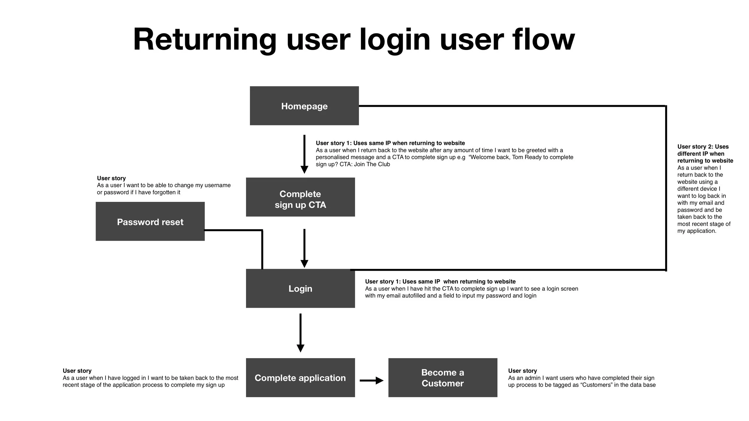
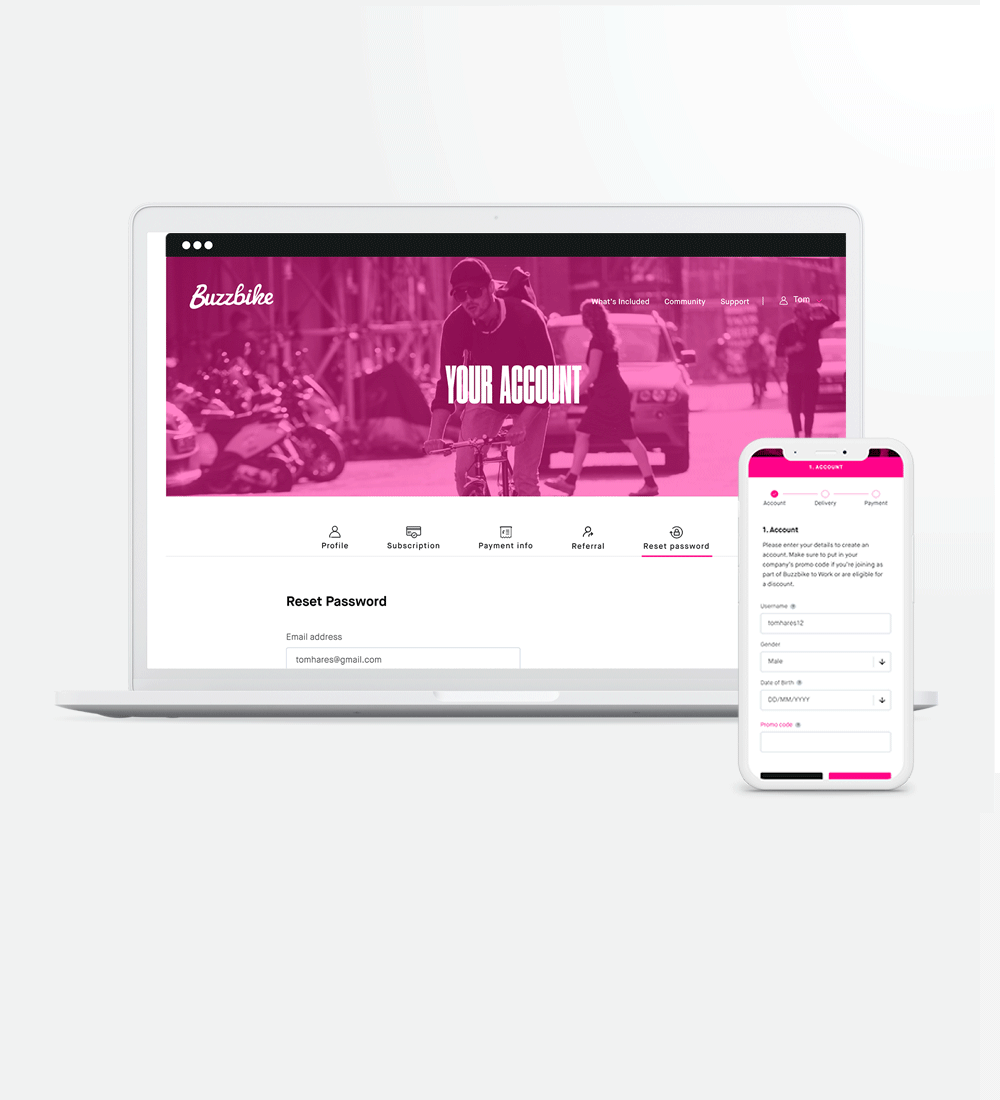
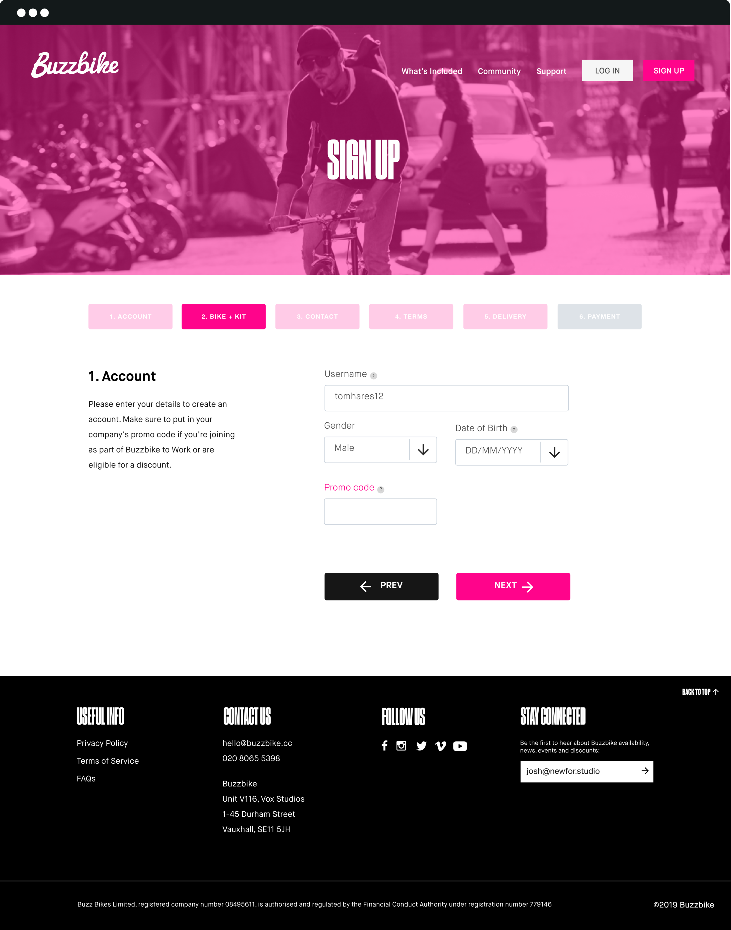
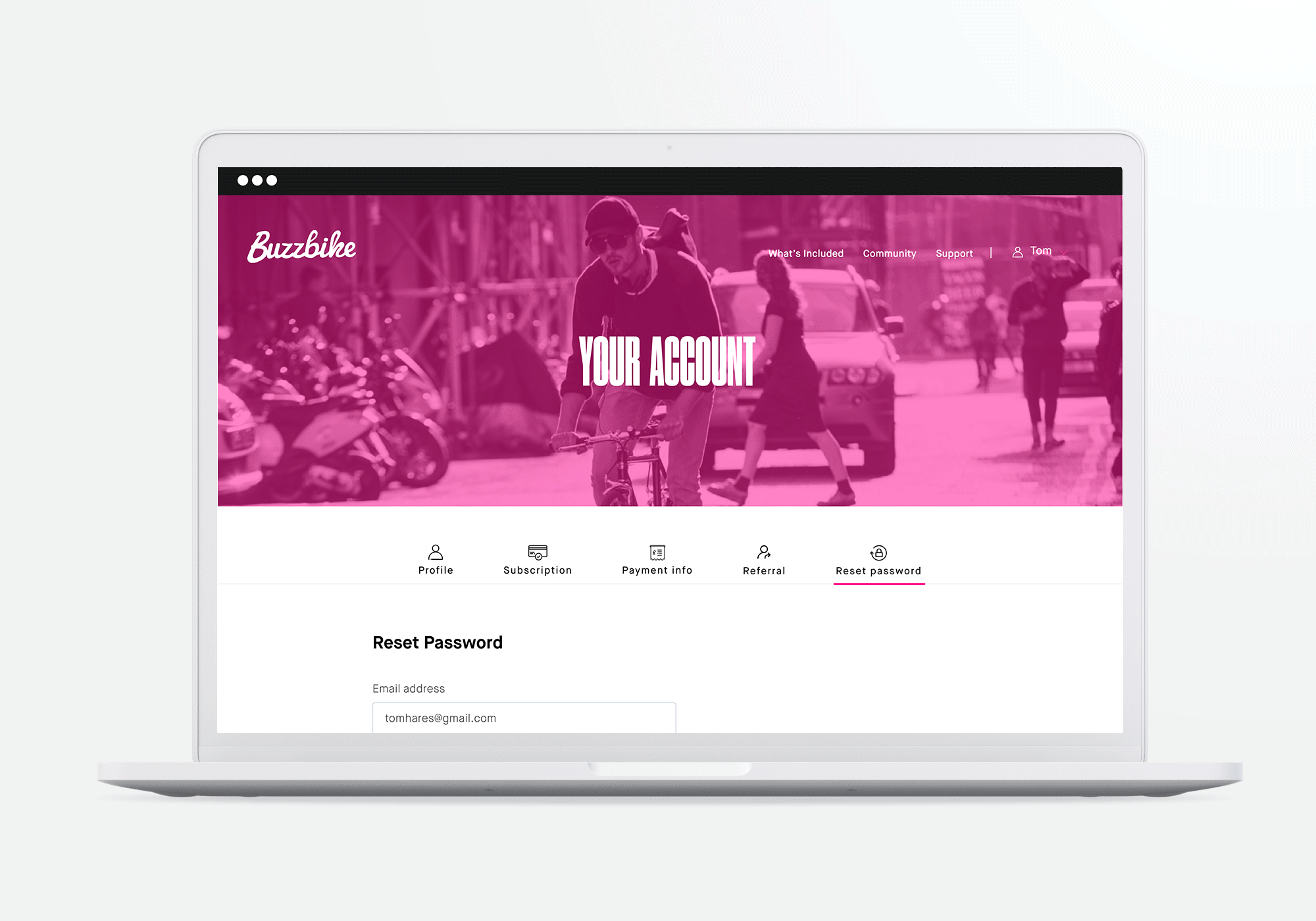
I was the UI + UX and visual designer responsible for the experience strategy, for their website and also designing user flows for the sign up journey, the on-boarding and the user’s account dashboard. I was responsible for the conceptualisation, visual and interaction design, production of all major deliverables and collaboration with the implementation teams to ensure the designed experience is conveyed by the final product.

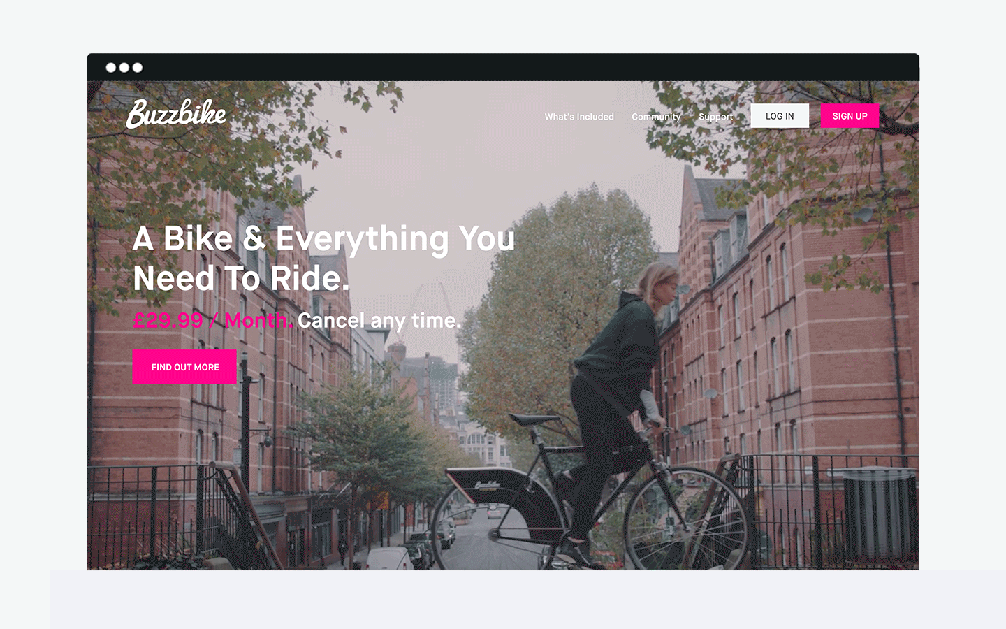
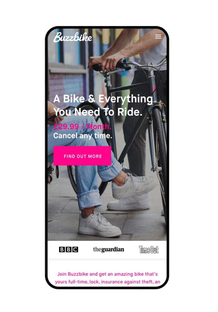
Over the last 4 years the market has been flooded with shared mobility providers. Buzzbike offers a solution that sits between bike ownership and bike share and to differentiate ourselves in a competitive market, we needed to define a desirable role for the website and collaterals and how it would meet the needs of the users.
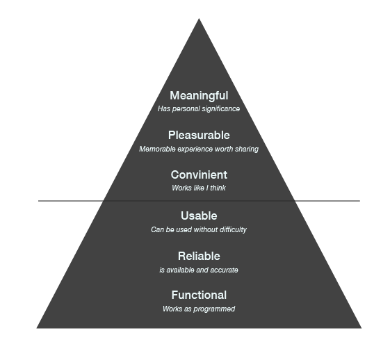
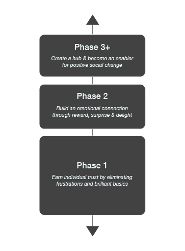
Aim: enhance the functionality and usability beyond competitors; and to promote active lives starting with the London community, with the advantage of data tracking and gamification.
Goals achieved: We saw an increase in conversion rate by 35% after the new designs, from 65 subscribers in January to 680 by November 2019.

Streamlining the sign up and log in flows along with the account dashboard. Allowing the user to make changes and view their subscription, rewards, etc. easily. This was done by designing the main screen in a way so as to allow users to quickly access primary functions, taking into consideration the size and order of icons etc. that make tapping easier and basing the layout on ease of reach and scalability.
Understanding the usage contexts of the app, helped me develop a clear vision of the tonal expectations of the user. To communicate the personality of our product, a set of experience principles of simplicity, playfulness, a sense of togetherness, encouragement and convenience, were developed. These principles were used to drive the aesthetic, look and feel and the overall tonal direction of the product.


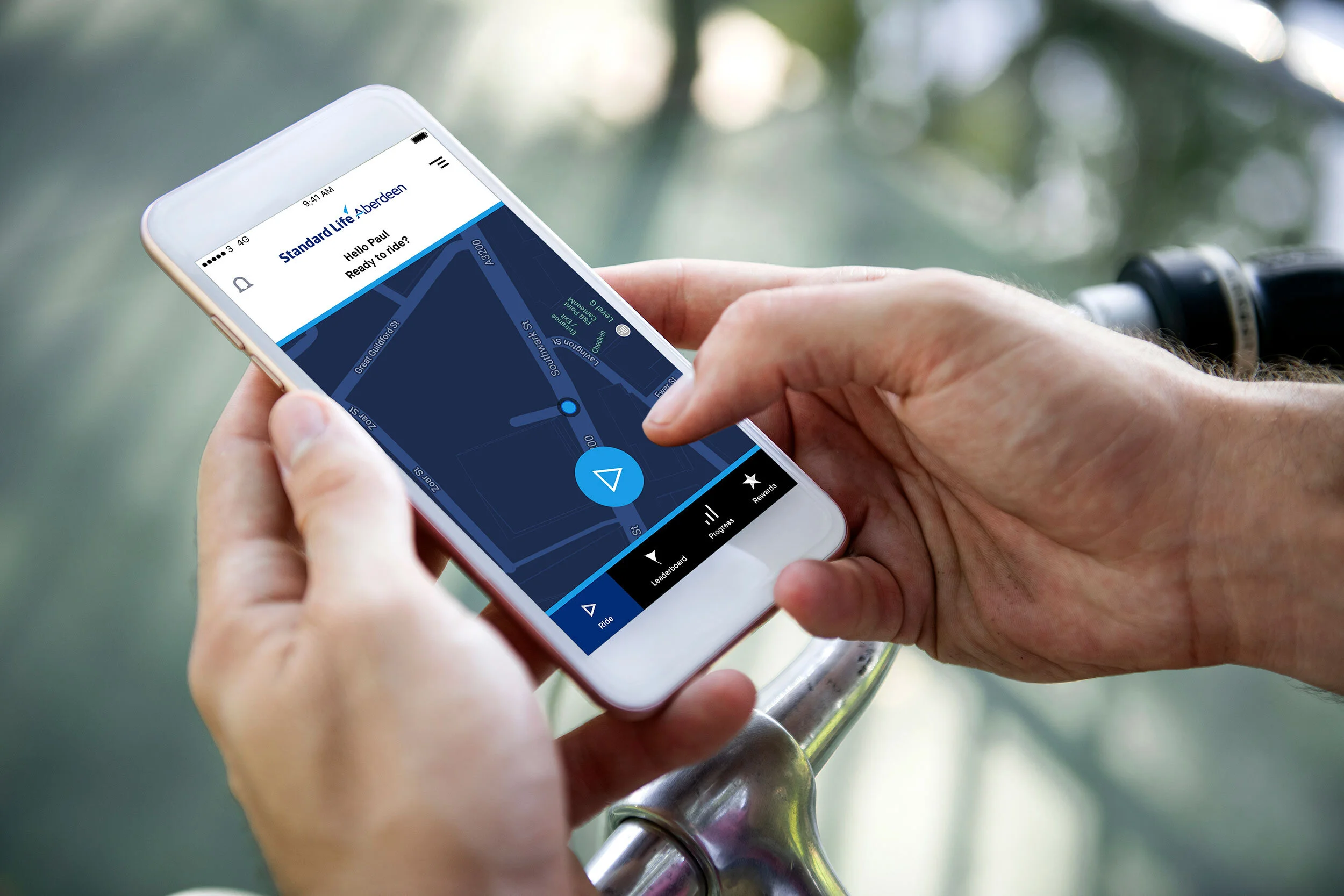
App designs for Standard Life Aberdeen adapted to their branding.