Citiza App
A portal for Indian citizens making government services available online

Timeline: Jan- April 2020, 4 weeks
Deliverables: End to end app
Team: Self-directed, with feedback from mentor
Role: UX/UI Designer
Tools: Figma
Design a citizen-centric app for the India which brings all government and council services available online to citizens, with their own personalised logged-in portal and dashboard where they can see everything related to their bureaucratic interactions.
This is a speculative project, and although I understand it is a really huge project with a lot of scope which could not have been thought through in full depth in such a short period of time. I still wanted to take the first step in to look at and work with this brief. To design an all encompassing portal for the citizens of India may not be possible today but it could be after some years.
Objectives
Make it easy to apply for government services fully online (while retaining the option to do it in person or by other channels as well).
Prepare a logged-in environment that would not only allow for all information to be in one place, but also reduce bureaucratic hassle.
Increase engagement by making citizens aware and responsible.
Challenge
How might we design an app that helps users accomplish tasks, understand relevent information easily and manage their day to day life better.
The Problem
Government institutions are falling more and more behind when it comes to the digitization of their services. These institutions are traditional, tedious, and slow. Every procedure and services are prone to tons of bureaucracy, involving many parties, lots of paperwork and steps.
Well-intentioned policies don’t always translate into meaningful and effective services for the community, but applying design thinking to government programs can help bridge this gap.
The way things take place currently are in an archaic, clunky, and confusing system that isn’t easy to navigate. Improving that system isn’t just about making sure the trash gets collected and the bus runs on time; it also involves making city services–for example, obtaining permits–more accessible for everyday people.
“It can help ensure that cities are responding to the concerns that matter most to residents and that the actual, specific needs of end users inform city priorities.”
There is a separation between those who make policies and those who deliver the services, and this often results in an incoherent service experience for citizens.

The idea is that every citizen will eventually be able to log in, and view or request any services that they need. Fully online. Fully self-service. However, those ideals won’t get fulfilled in the near future—it will take years to get there. But it would be nice to start adding the most common services such as:
Request birth, marriage, or death certificates (this is your focus)
Getting resident parking permits & paying parking charges
Voter ID + booth and other details
Ration cards, passport, LIC etc.
File a claim with the city, file complaints
Register a business/ property

[↑] The image above briefly drafts out government services that could be offered
The Process
Research will be conducted in order to best understand what features/information should be included in the logged-in environment, as well as how it’d work most effectively.

I followed human centered design and a lean UX design thinking process to ensure that my decisions were supported through user research and feedback.

01. Discover
Market Research / Competitive Analysis / 1-1 User Interviews / User Personas
Research Goals
1. Identify current trends and existing platforms for request of vital records
2. Uncover clear, accessible information architecture for civilian record keeping and interaction
3. Identify how users stay on track and deal with documenta- tion, services, licenses etc. currently
4. Determine what, if any, resources they use currently.
5. Identify what users expect to experience or want to know about. What are users’ main motivations in using government services?
6. Identify any unmet needs and frustrations with the current physical functioning of the government.
7. Understand and perform research on the System and current functioning of the organization.
8. Identify the citizen’s (user’s) needs for accessing and utilizing services; understand the concerns that users might have.
Research Assumptions
Users are too diverse and will need a simple application and information architecture to house various departments and allow users to perform functions with ease.
Users heavily rely on doing things in person and some people will prefer physically doing things as they may not trust the app initially.
Creating an account and saving information would be important to the user.
Competitive Analysis
Then I looked through other government and ran a competitive analysis. I checked other applications and websites designed specifically for citizens. Some offering government services online, some being a chat based app, or a personalised dashboard for the citizens. This helped me identify Citiza’s competitors and to see the differences in their products and the varying needs of different citizens and nationalities.
I gathered information on current government operations and potential models [↓] for provision of online services.
Surveys
I conducted a short survey to gain a better understanding of what Indian citizens from various backgrounds and age groups thought. The survey had a total of 34 people and a total of 10 questions. Ages ranging from 27-60.

“Sometimes they ask for additional documents that weren’t mentioned, which I obviously didn't bring and then I have to waste another day to do the entire process all over again!”


Conducting 1-1 Interviews
To learn more about their journeys, I interviewed 3 participants (P1- 58, M, Self-owned Business, P2- 35, F, Lawyer, P3- 28, M, Self-owned Business)
Interviewees and Survey participants came from a wide variety of backgrounds and ages from urban and suburban areas.
View Interview Guide & Debrief
Some participants mentioned how {Filling out} forms was the most confusing thing they’ve had to do. One participant mentioned how it was so annoying that the passport departments timings were wrong, where it said online that it was open only till 2pm but when I got there it was shut and they said it shuts at 12pm. So she had to come again and wait in queue again for an entire day for her police verification. She felt like there was absolutenly no point of an appointment as nobody followed any timings.
An interviewee filed a FIR for a hacked credit card which took him 4 hours, he had to wait in queue, explain the matter, and after that the policeman wrote an FIR in Marathi, and he was made to sign it, and he had to blindly sign because it was in the regional language.
02. Define
Pains:
Poor UI, confusing interface, uneasy to use and poor navigation
Worries about security of sharing personal information with untrustworthy sources
Existing platforms are not cohesive and dont seem legitimate, hence lacking trust.
Limited flexibility on customization of the app
Not having enough information and the right information - Limited information, resources, on understanding policies & schemes
Irrelevant and unnecessary information asked
No confirmation or updates regarding the application, can’t track progress
Too text heavy and cluttered, Limited visualizations, use of icons, etc to cater to all
Language Barriers, Accessibility issues & contrast
Forgetting due dates and having to set various reminders
Heavy documentation and understanding application processes
Lot of paperwork & Forms, having to fill complicated forms over & over
Not knowing who the local authority in charge is and not being able to reach them
Waste of time & energy by waiting in queues & being on hold over the phone for hours
Insights
Users would like to track and see progress on complaints or applications
Succinct relevant information which is easy to consume
Users were interested in knowing and taking action on issues in their locality and being an active member of the community, and make decisions together within it.
Users would like to understand what decisions are being made around them which directly/indirectly have an impact on them
Unifying user experiences would be a great place to start, a single sign on for multiple services and one portal trying to do this would be helpful as citizens interact with the government fairly infrequently and requiring a username and password and different modes of entry for different things is quite tedious, and so is waiting in a queue for 4 hours to get a thing done, which should on paper be really quick.
Citizens should have easy and clear access to all the information they need.
Voice interfaces and chatbots could be helpful too— depending on the task and information at hand.
Forms, the amount of paperwork and missing due dates really stresses people out — as they have a lot to keep track of.
Auto-filling and pre-populated forms based on the users profile


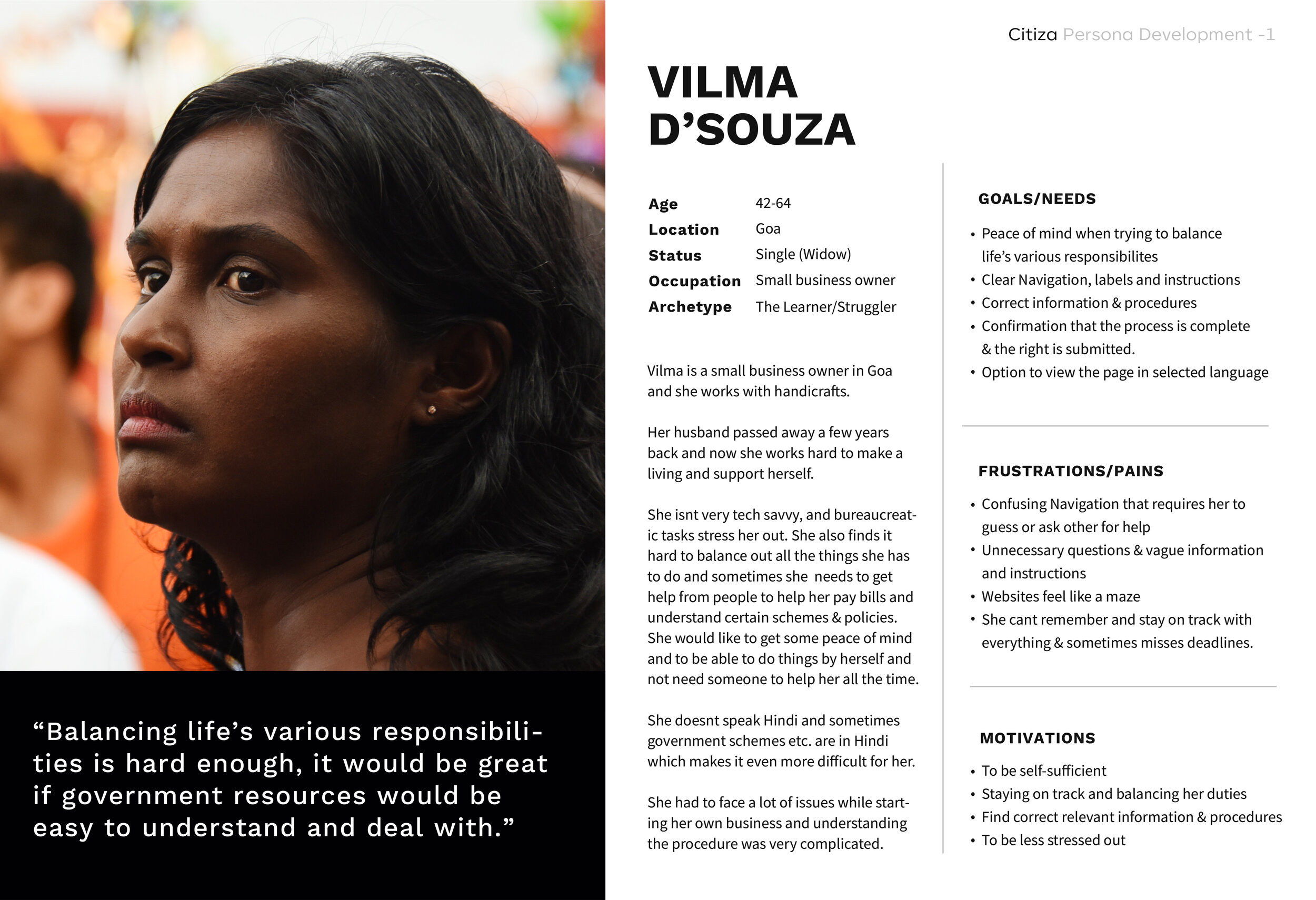
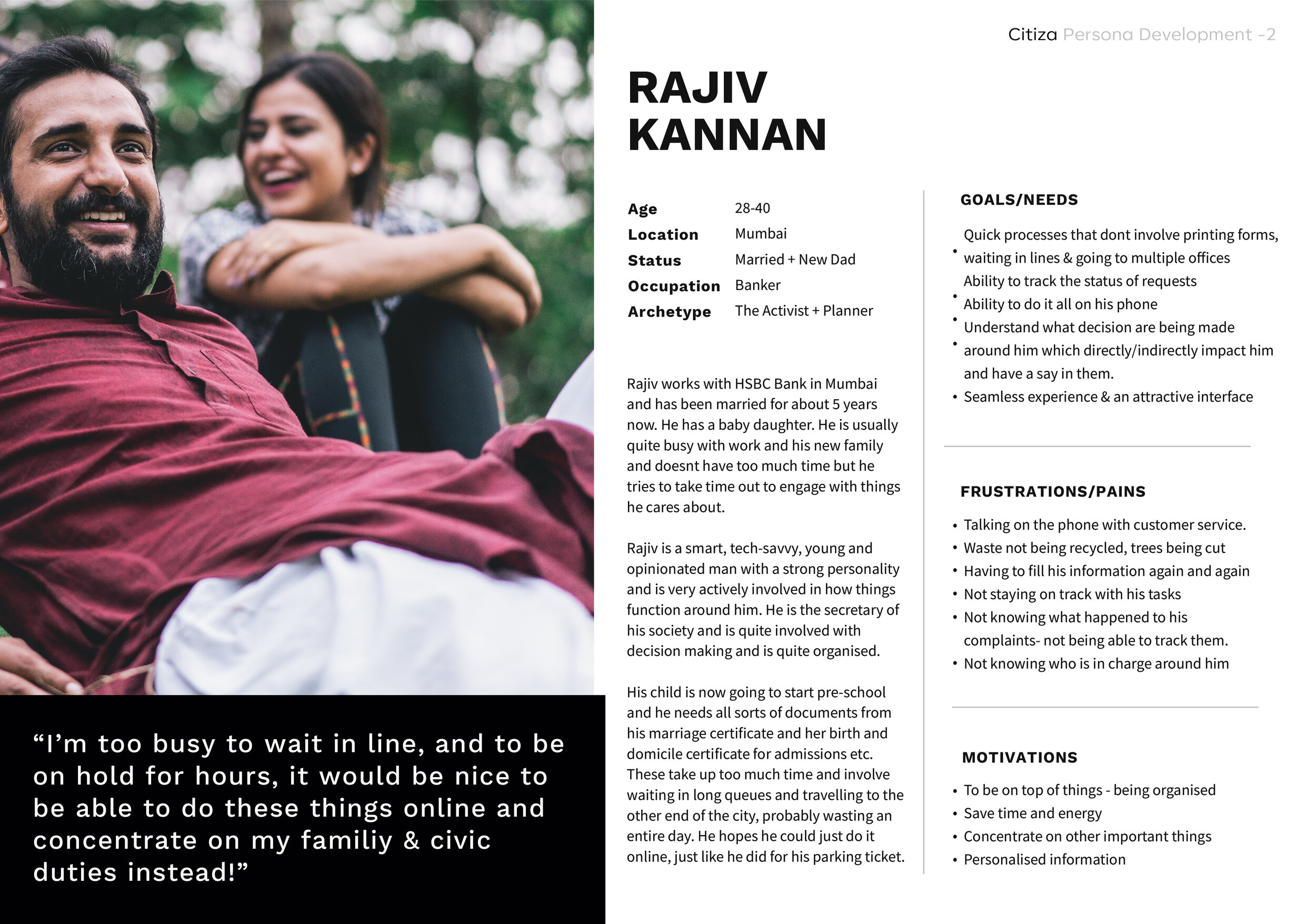
Persona development
Next, I developed 2 personas, Rajiv and Vilma, who represent the common traits and behavioral patterns observed from the interviews and research. This would help guide the rest of the user-centered design process.
03. Ideate
Product Feature Roadmap
I created a product feature roadmap in order to stick with features that met the biggest user needs found from research.

Information Architecture - App Map
After brainstorming potential features, I outlined four major app sections [↓]. The home screen contained customized reminders and updates for citizens, as well as voting events, emergencies, new updates, and popular resources.
Two other sections, Services which dealt with applications, payments and other services and Council which housed the community forums, and public reports were important for nurturing interpersonal relationships and community and to build trust, this also included departments and news, articles and guides organised by topic.
User Flow
Next, I designed three scenarios to showcase how users navigate through the screens to perform different tasks, and I get to optimize the user flow by observing the links and flows between each screen. Here, I thought about different entry points, exit points, and alternate paths.
I compiled the three tasks of :
Applying for a domicile certificate online & tracking it
Paying for an E-challan (driving ticket)
Filing a public works report

04. Prototype
Low-Fidelity Sketches
Before jumping into digital wireframing, I dedicated a few hours to sketch out different ideas for each key screen. I focused on the key features and the main pain points such as language & literacy barriers- where in the user can record the description instead of typing it out, a “My Documents’ section which would house all the users documents in one place which made applications and payments through the app really simple.
I also made use of existing design patterns and inspiration from established sources to ensure I was building screens and interactions that were intuitive.

Mid-Fidelity Wireframes
I used these sketches to kick-start my low-fidelity wireframes. I took the strongest components from my sketches. After I determined the basic layout of each screen, I started digitalizing the wireframes. During this process, I made decisions on the organization of the information provided and how that visual hierarchy would be presented. I decided to also start figuring out the copy and microcopy to get a better sense of the hierarchy and user flow, through the mobile app,

UI Design
I tried to modularize the layout and ensure consistency across all screens. I also looked at pattern libraries to determine the design patterns suitable for Citiza.


High Fidelity Prototype
A high, limited functioning prototype was created in order to test quickly and effectively find pain points within the Citiza App.

05. Test
Making a prototype using high fidelity wireframes to run usability tests.
I put together a mid-fidelity prototype in Figma to find out if the design has any usability issues. Although the prototype had limited functionality, test participants would be able to grasp the structure of each screen and identify any issues that might impact the user experience.
Usability Testing
I started by developing a test plan to include the key tasks users will perform. I successfully recruited 3 participants, to participate in the usability testing which was done remotely (due to Covid-19). But I was able to gain insights and feedback from the participants via video calls.
Objectives
To observe how users navigate through the app, and to identify the patterns used to complete tasks
To test if users are able to complete tasks successfully
To identify any usability issues or frustrations from users
User Tasks to Test
Log into the app
Access ‘My Documents’
Apply for a Domicile Certificate
Pay for an E-Challan (Driving ticket)
File a public works report related to ‘trash & recycling’
Synthesizing The Results
Test Completion Rate: 100%
All participants fully completed each task given to them
Error-free rate: 80%
2 out of the 3 participants experienced confusion where the ‘Public Works Report’ were
All participants enjoyed the details and information in the app, stating that it was nice to see that reports could be made using photos and a voice recording, instead of having make 20 calls to no avail and also be able to track the report.
A participant really enjoyed the fact that the domicile certificate form had an option of ‘For myself’ which would pre-populate all the basic information & data from the phone that the user had fed in which could of course be edited.
All participants felt the app was helpful, intuitive and easy to use
All participants enjoyed the ‘My Documents’ feature
All participants could navigate through the Citiza dashboard.
Design & Branding
After I revised the mid-fidelity wireframes, I started working to create high-level styling ideas. Bright orange is identified as the branding color. I used colours from the Indian flag but tweaked them to look a bit more modern. Then I put a style tile together to showcase the visual style of Citiza. Aside from the dark blue and the orange branding color, I also introduced a darker teal to enhance the color contrast and to improve the accessibility of the visual design. With these brand attributes in mind, I created the name Citiza.

Reflections
The greatest challenge of this project was understanding a complex state of affairs. Like an onions many layers, structural and governmental agencies, departments and processes are complex and multifaceted—by itself, especially in a country like India where the illiteracy rate is high, and many citizens dont have their documentation in place, an app like this in the future could really help streamline things and make lives easier for everyone.
This has barely scratched the surface of this massive project, but it has helped to give me an insight into what could be needed. This project requires a lot more extensive research to be brought into fruition but I feel like it could be possible after a few years where all a Citizens services and needs are met by an app on the go.
Next Steps
Conduct more intensive research
Build out additional screens
Continue to test and iterate the feature
Sources:
https://www.ideo.com/question/how-can-government-be-more-citizen-centered
https://www.fastcompany.com/3031874/ideo-rebrands-disaster-preparedness
https://new-ideo-com.s3.amazonaws.com/assets/files/pdfs/news/Metropolis_IDEO_govt_June2011.pdf
https://www.fastcompany.com/3065107/how-one-florida-city-is-reinventing-itself-with-ux-design
https://www.ideo.com/case-study/designing-a-city-emergency-plan