Prithvi Theatre
Build a responsive website for an experimental theatre.
Prithvi Theatre is an expanding non-profit specializing in collaborative theatre, which is committed to the development of the art & literary culture in the city. Founded in 1975, Prithvi has spent the last 40 some odd years maintaining their reputation as the small yet impactful theatre. This is a speculative project.
Timeline: Aug – Sep 2019, 4 weeks
Deliverables: Website prototype, Branding
Team: Self-directed, with feedback from mentor and peers
Role: UX/UI Designer
Tools: Sketch, Illustrator, InVision
Objectives
Help Prithvi, an event space/theatre in Mumbai, build a responsive website while carefully considering what role the website plays in the event finding, ticket booking & purchase process.
Develop or extend a coherent event booking platform that aligns with Prithvi’s current and/or desired clientele and customer experience.
Process
01. Research
Market Research / Competitive Analysis / Provisional Personas / Heuristic Evaluation / User Interviews / Empathy Map / User Persona
Research Goals
Understand what kind of individuals attend such events.
Define common behaviours of individuals attending such events.
Learn about their goals/motivations when it comes to watching /finding events? Find out what limits them from reaching their goals. concerns/questions
Define factors they consider when choosing an event to attend.
Identify what kind of events people like.
Understand what makes the experience of attending such events good/bad.
Identify How they learn about the events they attend / are involved in.
Understand how people would like to see the cultural scene in the city grow.
Identify how people like to contribute to this.
Market Research
Conduct research on the art/theatre industry, analyse competitors, and gather insights from Prithvi’s existing customers.
I started by collecting Prithvi’s information along with other event booking platforms online to learn more about them. I wanted to identify their opportunities or threats from the market trends. I gathered and analyzed existing trends, data, and insights to learn more about event platforms in Mumbai as well as in other places of the world. This helped me understand the industry and provide guidance in creating user personas.
Competitive Analysis
A competitive analysis was performed to understand the strengths, weaknesses, similarities, and differences between event booking platforms and other theatre venues in the city.
FINDINGS
There are not many competitors in this industry, at least not who have a curated list of art and literary events. There is an opportunity to use this to improve the efficiency of the event finding process.
There is very little information about artists and venues and a lack of details regarding events.
Finding events based on Genres of interest was difficult.
Provisional Personas
I created 4 provisional personas of typical event goers that reflected the data I had collected through secondary research. Understanding the target audience helped me think about how the website would appeal to different demographics with varying needs. These personas helped to recruit the appropriate subjects for user interviews and to begin the ideation process.
Online Survey
I conducted one online survey using Google Forms.
Conducting Interviews
I interviewed 4 participants in-person, 3 female and 1 male from the ages 24-60, Lower middle class to upper class individuals that enjoy attending art/design/literary events in Mumbai. People who enjoy attending art/design/literature events / People or Artists that belong to or are an active part of such cultural communities or art societies / People who use the web to locate, find and learn more about such events.
Research Assumptions
Many research participants must not use Prithvi’s website before, but they still have their own way of locating events to attend.
Users are unsatisfied with the current event finding structure in place.
Users are influenced by friends and other peoples experiences when choosing what events to go for
Location, price, interest, saving and sharing events would be important to the user
Findings & Insights
Most user find events in Mumbai - online through websites/apps or social media which friends are attending
Currently users avoid using Prithvi’s website to book anything and use platforms such as BookMyShow or Insider to browse & book.
Users find Prithvi’s website outdated and not reflective of the space
Convenience is an important factor in attending events, users find it frustrating when not enough information is available and they have to look at multiple sources to get that information to then make a decision.
Users are more motivated when someone they know are going or if they find someone to go to the event with them.
Users would want to share these events with friends on social media or be able to communicate with fellow event goers to increase interaction and this helps them decide if they want to attend the event
Users find it frustrating when they couldn’t attend an event because of tickets being sold out but later having found that there were tickets available.
Poor finding experience (users want the ability to filter the list of shows and see more info eg: posters to improve find-ability)
Users also mentioned that they wanted more information to help them choose a show. Items mentioned included show poster, price, genre, dates, a short synopsis, an offer/ incentive.
Users enjoy and go to Prithvi for the sense of community and interaction that it offers- maybe if we bring that sense of community online this would make their event finding & booking process experience better.
On watching interviewees use platforms like Bookmyshow/ insider.in- I realised that 80% was comprised of users landing on Venue or Event pages. Giving me insight into the 2 core user stories:
Users who want to see a specific event
Users who want to see any event, but at a specific venue
02. Define
Empathy Map / Persona / POV + HMW
Next, I used all of the qualitative data i gathered during the research process to create a persona.
03. Ideate
After formulating personas, constructing POV/HMW statements, and brainstorming features, I created user flows that reflected the main use cases. Interviews revealed that potential users primarily wanted to discover new events and/or locate specific events/venues. I designed the screens relevant to these flows: the homepage, a community (subscription) page to bring Prithvi’s sense of community online, a history page to show the impact Prithvi has made in the city, along with an individual event page showing the user all the necessary information.
Information Architecture
Product Feature Roadmap
A high-level list of app features was created to further define and guide the vision for the product. Prioritizing the features with supporting research created a clear order of execution.
Site Map
Next, I created a site map for Prithvi that outlines the websites navigation & Information hierarchy.
Interaction Design
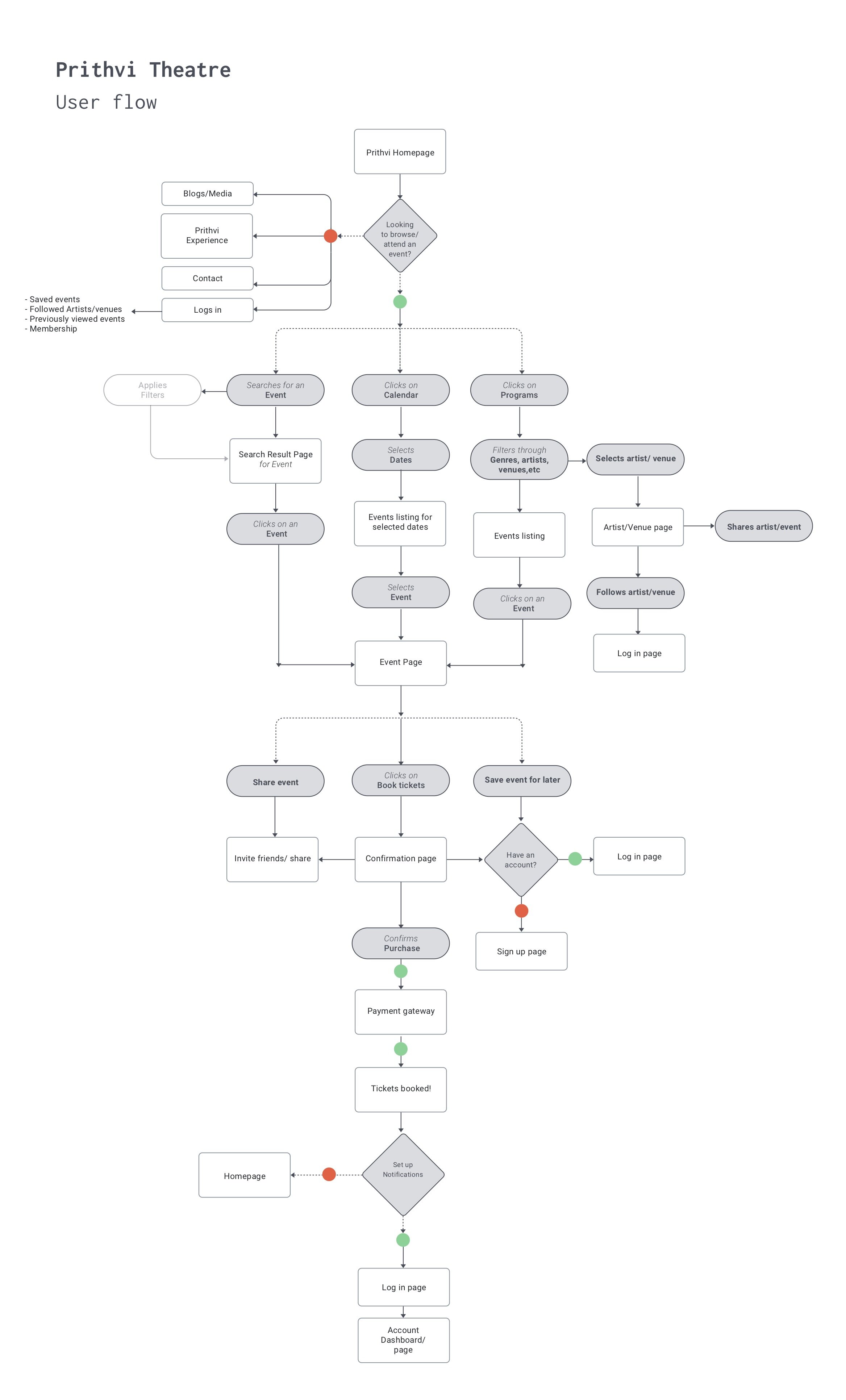
User Flow
User flow to imagine the ways a user might navigate through the website to browse events, save an event or book tickets. These tools helped me ensure that the information was organized in the most intuitive fashion for the user.
04. Design
Low Fidelity / High fidelity wireframes / UI / Style guide + UI Kit
Low fidelity wireframe sketches
I began the process of wireframing with sketches of several of the main screens for Prithvi. During this process, I thought about how the layout and content could be structured to satisfy user and business goals in a technically feasible way. The sketch I chose served as a guide for my digital wireframes.
Mid-Fidelity Wireframes
I created a UI requirements document to outline all of the features and elements I wanted to incorporate into the design. Once this was complete, I started creating digital wireframes for the main screens in Adobe XD.
Popular genres could be listed first on the page
Tailor the sort order by genre/ venue/ timings/ child friendly, etc.
Introducing an ‘upcoming shows’ section at the top of the page allows Prithvi to feature events
Community page - allows users to follow artists/ view artists links, identify which friends are going or find someone to go with through the site, while also getting recommendations based on their genre of interest.
UI Design
Finally, I applied the branding from the style tile to the mid-fidelity wireframes, the result of which was a set of high-fidelity wireframes/ UI design.
The basic information unit - the event card needed to be succinct
The cards allowed me to go through a series of layout experiments, while learning the most meaningful data to be displayed upfront.
Card-based event's list, with the most important information shown upfront i.e. the Genre labels, Language, Date & Time and the Price. And on hover the user was presented with CTA’s to either book tickets or learn more about the event
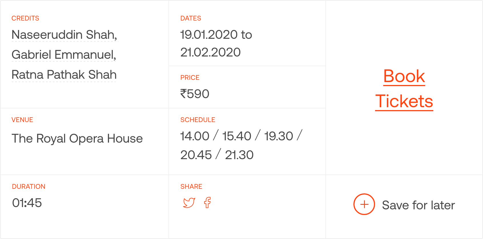
Event inside page showing information about the Cast, venue, duration, timings and price along with the options to Book tickets, Share or Save the event. The page also shows a summary of the event, links to the artists/cast along with a gallery & some past reviews.
The next challenge was figuring out the most meaningful organisation of all the events
Drawing on the user interviews I based the default sorting on the user's distance to the user. Building on different use-cases I identified a series of sorting alternatives (e.g. "Free entry" , “Child-friendly”, “Something nearby” - would bring the filtered events to the top of the list.
In addition to sorting, I designed a simple filtering UI allowing to adjust the list based on the users' top concerns, such as price, time, age limit, or a preferred venue.
The Prithvi Community Online
Bringing the sense of community and interaction that Prithvi offers, to the digital platform. Prithvi has been around for over 40 years, and has been committed to the development of the performing and fine arts. Its a communal space that fosters growth and interaction for new and emerging artists, hosts and conducts workshops.
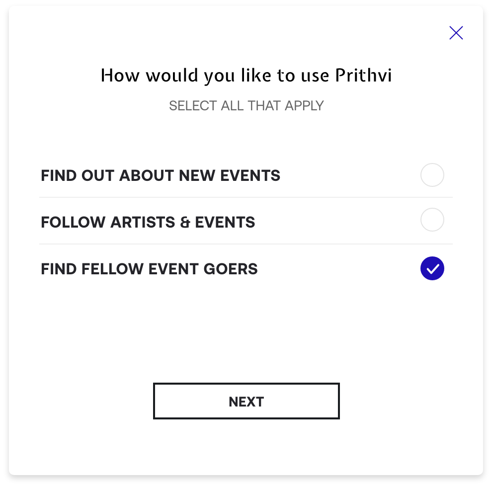
While signing up the user goes through a short onboarding asking them about the categories/artists/venues/art/event types that they are interested in and then are given event suggestions based on their inputs and interests.
There is a chat interface where fellow event goers can communicate. Community members can follow Artists, apply or save events/workshops, and also find out who is attending the event. This allows the users to find events based on their interests and genres they like through which they can learn and engage with the growing cultural community and stay up to date with what’s on in the city.
UI Kit
a comprehensive collection of all site components and UI patterns.
05. Prototype
The redesign allows for the site’s focus to stay on the art and events that it displays. I was a little apprehensive going into usability testing, since I knew that the design was a bit different and should cater to a wider audience. Nevertheless, participants were able to quickly and easily navigate through the website, and many commented on how they enjoyed that the site reflected Prithvi and felt like an artsy event. The main revisions were tweaks regarding contact information, restructuring of the ‘book tickets’ on the contact page and the making the timings and dates of events a bit more prominent.
Usability Testing
I asked 3 participants to test out the prototype's usability. The participants were people from ages 27-49. The participants were given four scenarios, each with a task to complete.
Tasks:
Save an event
Find and browse events based on their preferred genres
View the inside page of an event
Access Prithvi’s subscription based community section
Findings:
All participants were able to complete all tasks; But most issues users had were caused by information hierarchy.
Recommendations:
Move the contact section above the book tickets on the ‘Contact page’
Simplify the filters on the event finding page
Re-organize the information hierarchy of the homepage
Show genre tags and more information upfront and have clear CTA’s
After which I updated my designs to incorporate the findings.


